

The thrill of discovery during the painting of Misty Mountain prompted me to attempt a similar approach with United We Stand to share with our Monthly Membership. I recorded the process of painting Misty Mountain, a much larger and more involved piece, but that video is a ways down the road – unless human clones are invented who really want to spend all day helping me edit training videos – hmmm, any geneticists out there?

Misty Mountains by Bill Inman
Some trips are reserved entirely for family fun so I didn’t have my painting gear, but even on family trips I always have a camera handy.
This shot of the brilliant filtered light illuminating the leaves around the silhouetted stand of trees seemed like prime real estate for an engaging wrestle with some textured paint.

I had a ton of fun with this painting and hope you feel free to do some of your own experimenting while you follow along. At the end of the 7(ish) steps we’ll watch it all fall into place with a fast motion video.
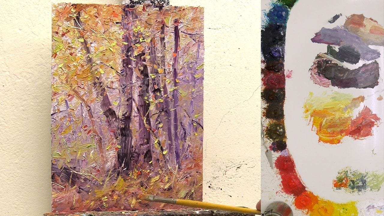
7 Steps to a Thick Pigmented Fall Scene
Step 1

Not for the faint of heart, I chose to begin with a thick layer of titanium white paint applied with a palette knife or spatula. There may be faster, better or easier methods for achieving textured fall foliage, but how will we know unless we throw caution to the wind and give it a whirl.
There are some practical benefits for the budget minded artist who craves thick paint texture – white is much less expensive than other colors we might use for thickly applied fall leaves – yeah, I’m talking to you Cadmium red, yellow and orange.
Another budget friendly idea – take those high interest credit cards and cut them up. It certainly worked for me – a slightly shredded credit card, with the front tips sanded ragged and splayed out for irregular marks, is what I used to swirl the texture in countless directions and lengths to mimic the myriad forest foliage and twigs.
Step 2

Next came the division of spaces, with the largest area reserved for the lavender background colors that would become a cool color complement that would withdraw enough to allow the warmer fall colors to advance to the front of the line.
A warm middle value reddish brown on the forest floor set the stage for highlights and dark accents to create a wealth of leaves, rocks and twigs later in the painting’s development.
Step 3

This part is tricky – adding darker valued tree trunks over that white bright paint makes me think of the dad of Chicken Little in the animated movie they made a few years ago, “Son, there’s something I want you to know…in about 3 seconds, I’m going to scream like a little girl!”. If we use too soft of a brush or pressure, the brush stroke will slip across the surface of the wet white pigment, resulting in a smeared look. I wanted a fun striated tree like bark texture, so I opted for a strong flat bristle brush like the Rosemary Ultimate that created these trees.
Even with a stiff bristle, I still needed to lay down the stroke in one fluid motion and then not fiddle with it, otherwise I disrupted the underlying paint and lost the texture or darker value. That ‘one fluid stroke without alterations’ method meant I needed to think through and mentally nail down the start and finish locations before I put brush to panel. I was not always successful on the first attempt. When the stroke went awry I would wipe off my brush, push it through the pile of dark lavender paint again, and either start the whole stroke over or find a good break point within the original stroke to try repairing the offending white paint infiltration. It takes some experimenting, but that’s why we have so much fun as artists!

Step 4

Now it starts to really get exciting – we can take off our jackets and begin adding the warmer foliage colors using combinations of cadmium lemon, yellow, red and orange, as well as quin red and a touch of Phthalo green here and there. You can see the advantage of the thick white paint within the leaf texture as the white brightens up the tree canopy and it is quick and easy to create a wealth of small twigs and textures that give a forest such captivating life and movement.
Step 5

Once the bulk of the foliage is established I begin to refine the color shapes and increase the contrast of dark and light. This is a good time to pay attention to the sizes of shapes overall as well, like the rectangle shape the group of trees makes, or the triangle of the orangish brown forest floor or leaves above or even the lavender background. We want to make sure that we have a strong mix of larger and smaller shapes for an engaging design as well as intentional directional lines and movement created by those shapes to guide the viewer around and through the painting – rather than all the shapes pointing in one direction and leading viewers right out of the painting and onto other artwork or lunch or their reflection in the nearby window.
Step 6

Another advantage of all that thick paint is that creating thin bright limbs using a palette knife becomes almost too easy (painting is supposed to be challenging after all or our creative intelligence will get bored and start watching political debates or some other mind numbing rhetoric – sorry, didn’t mean to scare you, but we artists can’t let our guard down – we need to keep challenging ourselves every day).
Step 7
With all the major shapes developed and most of the under-layer limbs and branches in place, we can put in the smaller tweaks and touches that bring vitality to our work, like small bright leaves or dark shadow accents next to a rock or clump of grasses, or maybe a touch of cad orange straight from the tube for some zing. These final 10 percenters are often the life-blood of a painting – they add realism and 3-dimensionality to a 2-dimensional painting surface.
And voila, it’s done…
Step 8?…

Nope, it wasn’t done, because I have Kristie. She strolled over to my studio and pointed out some shortcomings like the migrating palette-knife-created V’s following the diagonal tree trunk right out of the painting.
So, with a few final touches the painting was ready to place against a wall for a few days or weeks, at which point I will look at it again to see if I like it or not.
This painting was part of one of our member Paint Togethers – our community created a stunning collection of unique interpretations of this scene. Why don’t you give it a whirl – come on, you know you want to. Using a thick layer of white paint to begin your paintings might not get added to your top ten list of optimal methods for creating captivating fall foliage, but then again, it might just become your favorite technique – you won’t know until you try.
Experimentation and courage are the name of the game for keeping us consistently progressing and expanding our talents.
What useful tricks have you found while painting?


Bill…do you let the titanium white dry to maintain the texture and avoid whitening out of subsequent before you proceed.
Could one apply moulding paste and let it dry rather than using all that titanium white? Interested in your thoughts.
I was thinking same.
Great question Janne – this was a fun experiment to see what mixing colors into the white paint, right on the panel instead of on the palette, would do to the colors, especially with so much white right at the start. I love the wet into wet blending strengths of oil paint – the way I can manipulate edges and mix colors together with either a light touch or a stronger pressure depending on how much mixing I want to have at that moment. For instance, with wet into wet (or direct or alla prima) if I am putting in a tree branch, I might start off with a thick layer of paint on top of another layer of wet paint, laying it on in the beginning of the stroke without mixing it with the under layer – just laying one layer over the other – and then part way through, change the pressure a bit and slightly blend the two colors together to change the look of the branch – like when a branch goes from shadow to more light, or to change the color a bit by blending the two layers together. If I was only going for texture, which with this experiment was not the case, the molding paste might be a better way to go. If you decide to use molding paste it would be wise to consider that molding paste is an acrylic product and could cause adhesion problems eventually. If you use molding paste for texture make sure you use it on a solid surface like a wood panel to help the oil paint remain attached to the acrylic (the same could be said for acrylic gesso). It’s helpful to remember that oil is not porous and eventually dries hard and much less flexible than acrylics – which is why we see so much cracking in older paintings, especially on canvas. Acrylic (plastic) is porous, so oil paint will form a mechanical bond with the minuscule holes in the acrylic. If the acrylic stretches from temperature fluctuations or the flexing of a canvas, the oil will not stretch as much and can crack and fall off. That’s why it’s better to paint oils over acrylics on a solid surface. Based on that understanding, painting wet into wet with straight white oil paint is a better option than using molding paste. Even if we use just oil paint, if we paint thick, it is still a good idea to use a solid surface like a wood panel to avoid future cracking since oils are not very flexible – although they dry so slowly that with some thick areas of paint the inside may take decades to fully dry to a solid state, so it may take a while before you notice any cracking on a flexible surface like canvas.