

There is a fantastic little amusement park and zoo at the City Park in Pueblo, Colorado. After a fun filled afternoon of riding the train, roller coaster and carousel, we headed back to Kristie’s father’s home in Penrose.
The clouds built up steam until we were surrounded by a festival of quick bursts of light behind and expanding reds, oranges and yellows ahead as the sun set on a swirling sea of storm clouds.
Our camera flashed as well from the safe confines of our van as we tried to capture some of that brilliance on film. Finally, we knew it was time to brave the elements – we pulled over and stepped out into the howling winds to get a much clearer view than our dusty windows allowed.

This photo held a wonderful mix of the dramatic qualities that made that storm so compelling.
I decided it would make a superb addition to our monthly members’ library so I played with the image in Photoshop a bit and prepared to paint.
If you’re a Monthly Member and want to view the full length 3 hour instructional video you can sign in and watch it here: https://www.masteroilpainting.com/monthly-member-videos/
If you’re not a Monthly Member, but would like to learn more about it you can do so here: https://www.masteroilpainting.com/monthly-member-landing
7 Steps to Paint a Rocky Mountain Sunset
Step 1

Since the clouds would contain so many lavenders shades, I decided to begin with a wash of Transparent Oxide Yellow to add a harmonic color that would temper the cools in the lavenders. That warm yellow would also work well with the sunset colors streaming through the clouds.
The warm Transparent Oxide Red on the bottom of the painting will act as a complement to the green pinon pines and prairie grasses growing throughout the bluffs. That reddish-brown tone will make my job a lot easier since it resembles the red dirt and rocks characteristic of Colorado.
After the initial washes, I mixed up a large pile of purple paint to lay in the middle value lavender tones of the clouds. Once I have a good amount of lavender ready, I can modify the color with warmer and cooler shades and lighter and darker values to create variety throughout the clouds.
Step 2

I used a large soft hardware store paint brush to quickly lay in the clouds with thin layers of color that alternated from opaque areas that almost completely covered the under layer of yellow, to faint glazes of dry brushed paint that allowed the warm wash to glow through as though the setting sun was penetrating the misty vapors.
The sky found its way through breaks in the clouds as well and because of the lessening light took on a cobalt blue look rather than the manganese or cerulean hue of a clear daytime Colorado sky.
Since I don’t keep cobalt on my palette I mixed Ultramarine and Manganese Blue, with a touch of Phthalo blue to achieve that cobalt hue – with some titanium white of course.
At first, using a Rosemary Ultimate Long Flat size 12 brush, I laid the blue paint straight on the yellow wash, but since I was working alla prima and keeping the layers of paint fairly thin, the yellow disrupted the cobalt color.
I could have applied the paint more thickly to avoid the blending of colors, but I decided to use my paper towel and wipe off most of the original wash and start over with just the blue and a hint of yellow underneath.
Step 3

The distant Rocky Mountains looked purple in the fading light.
The mountains were created in two steps – first, I brushed in the lighter value lavender for the bulk of the mountains and then I added a dark upper edge where the contrast gets stronger because of the silhouetting effect of the sun.
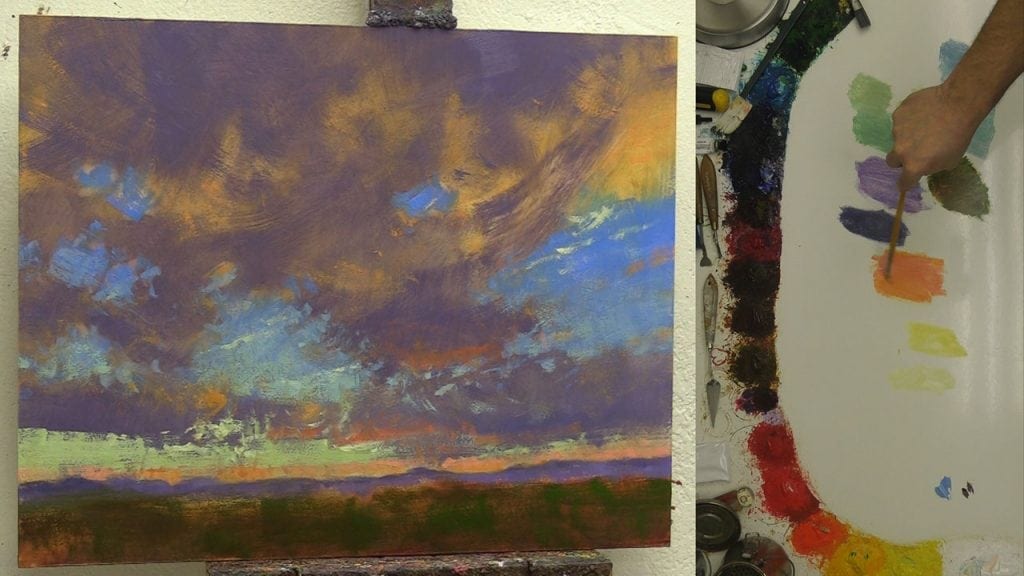
Step 4

Using my Utrecht Series 207 Flat size 8 bristle blend brush I began dry brushing orange tones over some of the clouds to emphasize the feeling of sunset and start the process of creating the red and orange tinged edges of the clouds.
I’m constantly changing the direction of my brush strokes and move my brush in forward and back flat sweeping motions to get wide, thin dry brushed effects, allowing the slight texture on the panel to gently lift the paint from the brush and help create that feeling of misty luminous clouds.
For some reason, the blend of the synthetic and natural bristles of the 207 series keeps the brushes from splaying and flaring too much – when I tried similar techniques with the Rosemary Ivory synthetic brushes the bristles immediately got a case of split ends and curled in all sorts of unhelpful directions.
So, if you like to push your brushes forward, avoid straight synthetics and opt for natural hog bristles or a blend that favors the strength of the hog bristles.
I use the blend rather than straight hog bristles because the blend has a nice spring to it and holds the paint differently enough that it seems to lend itself more to certain techniques.
It was also time to add the lower sky color, which to me looked distinctly green. Using a mixture of Manganese Blue, Phthalo Green, Cad Orange, Cad Lemon and white I experimented with warmer and cooler greens. I settled on the warmer mixture to keep in harmony with the warmer overall color temperature created by the setting sun.
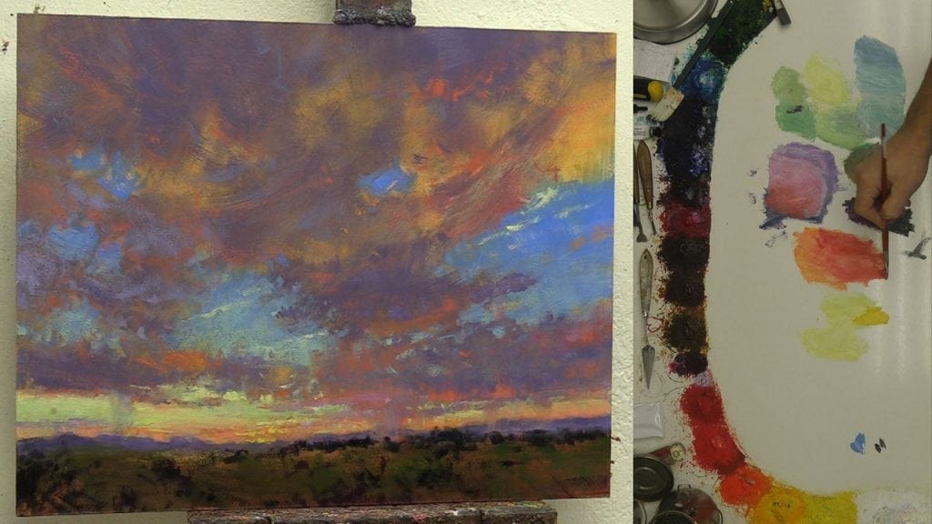
Step 5
Once the larger color masses were in place I jumped into the refining and clarifying stage with gusto – developing by degrees the painting all over rather than finishing one area before moving on to the next.
That over-all approach helps me to see how one area affects another so I can modify and change direction if that is what is needed to keep all the areas in harmony.
You can see that I added the base middle value greens for the foreground foliage in an indistinct abstract way that allowed me to enlarge, shrink or move plants at will. Avoiding too much detail early on made it a lot easier to manipulate and maneuver the objects to create a more compelling composition.
I started playing with value and color shifts in the sky and clouds and added bright thin lines of white (with a touch of Cad Lemon) that resembled moisture trails from planes to give some punchy bits of contrast and sparkle to the sky.
Step 6
Now it was simply a matter of playing with darker accents and brighter highlights, working back and forth with warmer and cooler lavenders for the clouds and reds and oranges for the sun lit edges, until the different elements felt natural.
The pinon pines gave me an excellent opportunity to add some much darker shapes to help the brighter sky feel even lighter. With sunset paintings, it is easy to get overly dark and ominous and risk losing the viewer.
As a species, we are much more comfortable with light than with darkness, so it requires a delicate balance to capture a light filled sunset that will engage the viewer while still maintaining the feeling of evening.
Step 7

In pursuit of that balancing act, Kristie thought the darker blue sky might be too intense, and after some pondering I agreed.
So, I decided to increase the scope of the lower light yellow-green sky color and dry brush with increasing layers over the darker blue until it felt right. The touch of added green also seemed to complement well with the reds in the clouds.
Notice, I added a small canyon on the lower left to increase the sense of light and shadow in the foreground and give an entrance for the viewer to journey towards the setting sun.
Then it was simply a matter of small refinements and adjustments to make sure all the shapes, large and small, created a pleasing composition and the impression of movement to lead the viewer around the painting.

A Royal Sunset 16×20 by Bill Inman
Now let’s see everything come together in fast motion:
It’s your turn! Play with these 7 steps I used to create a stormy looking sunset painting and create your own version of a magnificent Rocky Mountain Sunset.
Test things out and experiment – don’t be afraid to wipe off, paint over or change direction. That’s the beauty of oil painting – we can easily erase or replace.
Wherever you live on this amazing planet, take some time to watch a sunset and revel in the majestic display Heavenly Father designed to make us smile.


Wow wow wow What a generous piece of teaching this is,
what a generous teacher you are. Thank you, Bill. xoxox
Thank you Sara, that makes my day! I love to hear that these posts are helping other artists.
Dear Bill thank you for an awesome inspiring video. I came across your website after my first hand surgery. Have had another one but am healing well and cannot wait to start painting again. Will definitely check in with you again and follow your painting courses.
Just lovely Bill! I love all the colors and really love when I get to see skies like that myself! Always takes my breath away at the gifts God gives us!
Thank you Diane – I hope you are getting plenty of painting in!
Very helpful, Bill, Thank you for sharing like this.
You are very welcome Earl! I love to see your beautiful paintings in the FB group. Happy painting.
What an awesome painting! A feast for the eyes – Love it
Thank you Donna, I really appreciate your kind words!
Thank you, Bill. I so enjoy your videos. As a beginner…started doing this in retirement with no training ‘painter’….I just love watching you work. I also love the Christian joy and spirit that shines through your work.
Thank you so much Teresa! Don’t worry too much about trainers – this is a golden age for learning with so many resources available – you will painting like a pro in no time. Christian joy is a perfect phrase – to me the Gospel of Christ is a Gospel of joy – I’m glad to hear that the joy it brings me comes through in my paintings!
Thank you Bill for this great demo. I can’t wait to do it “with you”.
Thank you Lord for giving us such great inspiration.
You’re welcome Ursula – thank you for the uplifting comment!
Thank you for the terrific lesson. What is the music playing in the background? I loved it too!
You’re welcome Danna! The music is from YouTube – part of the Creator Studio – I’m grateful for that because buying the license for music can get a bit pricey. I have to search through a bit to find music that seems to fit, so I’m glad to hear you liked it.
gracias por el aporte para acrecentar el conocimiento de tu prójimo.
You’re welcome Liliana!