

How do you paint aspen trees? Great question! Let me show you in these 9 steps how to paint colorful fall aspen trees.
Aspens are gloriously fun painting subjects. 30 years of observing and painting them, in the studio and plein air, and I feel no hint of waning interest or slowing down. And 12 years living at the base of the Greenhorn Mountains ensured that my lively enthusiasm for aspen trees would last a lifetime.
I compiled this panorama from several 4×6 photos I took in the late 90’s.

What is it about aspens that has scaled the heights of my artistic curiosity and happily held hostage my easel? Spring, Winter, Summer and Fall – as you can see there’s not a season missed while exploring the swiftly shifting shades of wind tousled leaves and spiraling, twisting, trademark trunks that perplex and enthrall my abilities to capture them in paint.

Spring Aspens 8×10 Oil Painting by Bill Inman

Six Days Before Christmas 10×8 Oil Painting by Bill Inman

Graceful Autumn 20×24 Oil Painting by Bill Inman

Pure Gold 24×30 Oil Painting by Bill Inman
Challenge – that’s what motivates all my painting endeavors. There aren’t enough lifetimes to adequately drink in the stream of painting possibilities that float through my imagination when I consider the colors and quirky character of aspens.
Do aspens ascend the ladder of your own interests and artistic pursuits? Then maybe a few more images, a 9-step painting process and a video tutorial will help spur you on.

Kings Court 16×12 Oil Painting by Bill Inman

Twilight Tango 30×50 Oil Painting by Bill Inman

Aspen Ridge 24×30 Oil Painting by Bill Inman

Autumn Sentries 16×12 Oil Painting by Bill Inman

Aspen Glow 20×24 Oil Painting by Bill Inman

Birdsong 18×24 Oil Painting by Bill Inman

Lost Trail Found 20×24 Oil Painting by Bill Inman

Sentinels 24 36 Oil Painting by Bill Inman

Guardians of the Valley 16×20 Oil Painting by Bill Inman

Colors of the Wind 30×40 Oil Painting by Bill Inman

Bedazzled 24×18 Oil Painting by Bill Inman
Take these 9 steps, tailor them to your tastes and create your own Aspen Tree Masterpiece:
1.
There isn’t a specific reference image because this painting was conjured from my imagination. During the Facebook Live Fly on the Wall sessions and for the viewers of the video I placed 3 previous paintings on my monitors to give some indication of the direction I might take.
Since I envisioned a lot of green foliage in the lower portion of the panel and planned to place a lot of blue and lavender colors in the upper background, I used comparatively complementary hues for the washes to cover the surface. The reddish-brown transparent earth colors create a vibrant interaction with green foliage and the transparent earth yellow adds a wonderful warm glow to the overall cooler hued background.
2.
Lavender is considered a cool temperature color, but there are endless variations of warmer and cooler shifts that can be engaged to make the background more stimulating.
There’s nothing more fun than throwing a bunch of color shapes and slashes around a panel and then dreaming up ways to magically transform them into trees, bushes, rocks or some other natural wonder.
3.
Using negative and positive shapes, I began to form the semblance of trees. At this stage I am particularly focused on placement of shapes – whether tree trunks, leaves or bits of sky, the object itself is irrelevant – it is the interaction of warm and cool colors, light and dark spaces and movement of line that is guiding my brush strokes. I am already thinking about the viewer and how to engage meaningfully and move through the painting whoever is looking.
4.
With plenty of shapes placed strategically throughout the painting I take the primary aspen tree and experiment with some light and shadow color variations – especially warm reflected-light tones that counter the cool background colors and pull the aspen tree forward. It’s a lot of fun to play with glowing, softly transitioning hues within the bark of the aspens. The middle of that trunk flows from green to lightly orange tinted yellow to salmon color.
Those colors were applied with a bristle brush, but that is not a rule for me – I switch back and forth between bristles, synthetic blends and natural hair brushes constantly – just depends on the alignment of the stars or what I ate for breakfast I think. Okay, there might be a bit more to it than that, but there’s so much intuitive action involved that it is nigh on impossible for me to nail down a definitive reason for one brush over another. There are just too many minute variables that affect my decisions. You will want to experiment and get a feel for your tools and eventually it will become second nature to you as well.
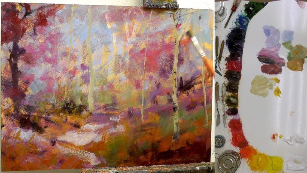
5.
Fall colors rule the day – all those greens I initially intended to use were overrun by stampeding oranges, yellows and reds – sorry greens, but Fall is my favorite season to paint, besides Winter, oh and Summer of course, and I certainly can’t forget Spring.
You can see that I am gradually working my way around the painting refining spots as I go. One of the best traits of aspens are the deer bites and diseases (what a horrible sounding thing, to get so excited about some poor plants woes) that create such wonderful contrasting dark shapes that I can place wherever I feel the tree or the painting needs it. Those shapes allow me to add incredible variety of highlight and shadow throughout the piece. I use those contrasts to guide the viewer and add interest to the painting.
I start purposefully pushing the intensity of the colors as much as I can with middle value hues – hopefully without overwhelming the overall harmony. Those middle values give me the backdrop for the final sparks of brighter leaves and branches.
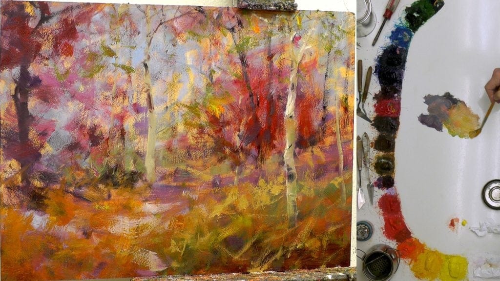
6.
Now the real fun begins as I add dark and light branches and foliage to the composition. We want to avoid the idea that branches are important because trees have branches. We don’t paint in branches because nature says we should – branches are used to add interest and movement, to break up spaces and to add texture and whimsy to our paintings. Thinking this way will help us fight off the doldrum demon that wants sameness to imprison our paintings.
For the foliage, I pulled out the big gun – my Utrecht 103 long filbert. The extra-long bristles allow me to push and pull the paint in an unpredictable, haphazard way, helping me avoid pattern and repetition.
7.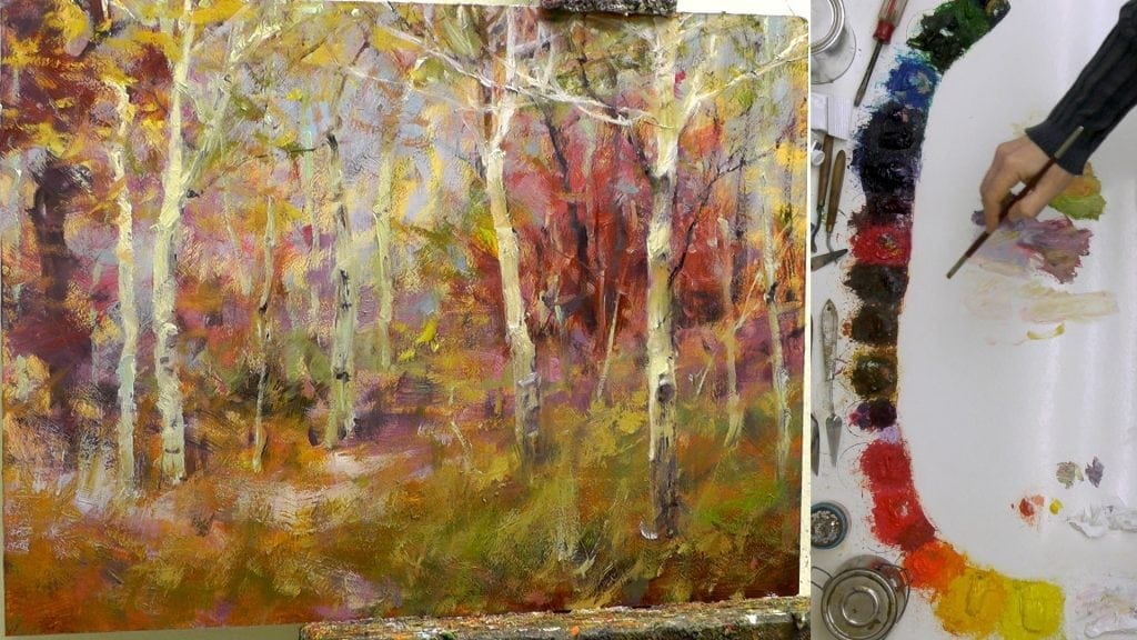
The grasses on the lower right half felt too vigorous with the sharp lines and strong value contrasts – they drew attention away from the stars of the show. So I tempered them down by loading a brush with some brighter middle value color then pulling paint lightly off the brush with an upward stroke.
I also started adding the final refined branches that help define the primary center of interest.
8.
Kristie thankfully pointed out the train track trunks on the left side. I had developed the right trunk more than the left, but the right trunk was spaced about the same distance from the left painting edge as the main aspen was from the right painting edge. So, I chose to gently fade the right trunk into the background, creating a more dynamic compositional arrangement of shapes.
The foliage throughout the painting was enhanced with greater tonal ranges of value and hue and the 3 main aspens were brought to their final refined stage.
At this point I thought the painting was done so I signed it (about 2 minutes after this photo).
9.
Since I had a few days to observe the painting before I shipped it off to the Broadmoor Galleries in Colorado, not surprisingly, I found areas that needed some tweaking.
I added some extra branches over the middle of the large red bush to help push it back in the composition and to break up the strong warm shape.
I also decided that the too-vigorous foreground grasses had become lethargic. So I pumped some energy back into them with a few additions of blueish-green brushstrokes – not too many, just enough to add vitality. A touch of that cooler hue on top of the warm oranges and yellows was just what the paint doctor ordered.
I did the same thing, only in reverse, to the large lavender shape in the middle of the left edge of the painting by placing in some warm orange tones that were just a step or so brighter in value. I didn’t want them to stand out like a lighthouse beacon so I kept the value darker.
Here’s the fast motion video I promised, filled with lots of good voice over instruction. Our Monthly Members can view the full 2 1/2 hour instructional video, along with hours and hours of other great full length videos, by clicking here (www.masteroilpainting.com/monthly-member-videos).
If you’re not a Monthly Member, but would like to learn more and view one of our full length videos for FREE you can check it out here: www.masteroilpainting.com/hammock-stand-bonus-video.
Now go experiment and discover for yourself the incredible joy found in painting aspen trees.
What advice do you have for someone trying to master the beautiful aspen tree?
Happy painting,
Bill


