
My Painting Looks Flat
The drawing may be sound and the colors may be beautiful, yet the painting still feels flat. That usually points to timid value relationships—not a need for more detail.

The lights and darks stay too close together, so the forms have no clear turn and the whole painting reads as timid.
Before adding more detail, squint and compare your darkest dark with your lightest light. Then check whether every shadow agrees with one light source.
Watch this first
Be bold with values; timid values produce a timid painting
See how stronger darks and clearer lights give the forms depth, strengthen the composition, and create a more deliberate path for the viewer’s eye.
Taught by Bill Inman. Source lesson: 3-25-2025 Critique All Out, 01:01:01-01:02:25.
Diagnose it
What to look for in your painting
Run through these at the easel before adding more detail. If several are true, the painting probably needs stronger value structure.
Try this at the easel
Reset the value structure
Use the darkest and lightest areas as anchors, then make every other value answer to them.
When a painting looks flat, do not reach for more detail first. Commit to real darks and real lights, and make every value obey one light source.
Squint at your reference and find the single darkest and single lightest area.
Mix each one honestly—darker and lighter than may feel comfortable.
Place those two anchors before adjusting smaller passages.
Re-judge every other value against the two anchors.
Step back and squint again. Look for clear light-and-shadow shapes instead of one gray middle.
Go deeper
Continue learning inside Master Oil Painting
These three resources move from the value principle to practical checking and a fuller working range.
Already a member? Log in to watch
 Members
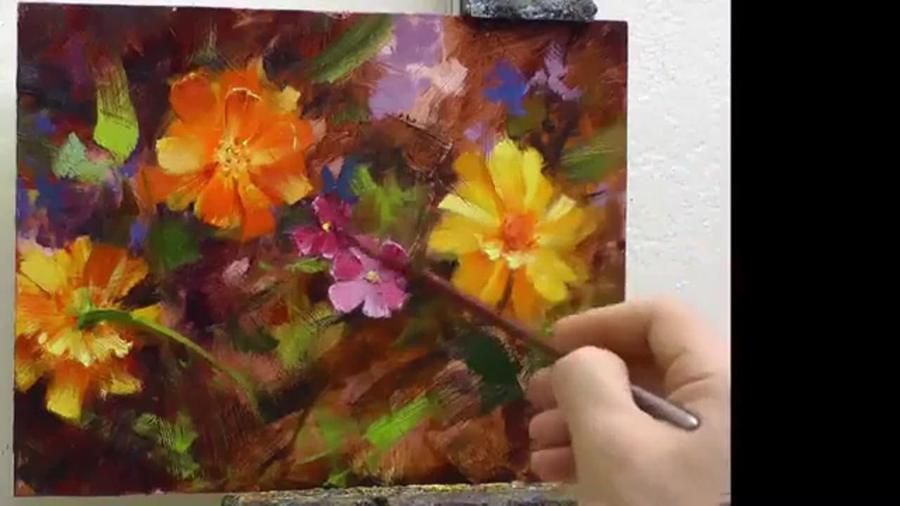
Highlight and shadow logic
See how the light source controls highlight and shadow placement, and why nearby darks help a highlight shimmer.
Log in to watch →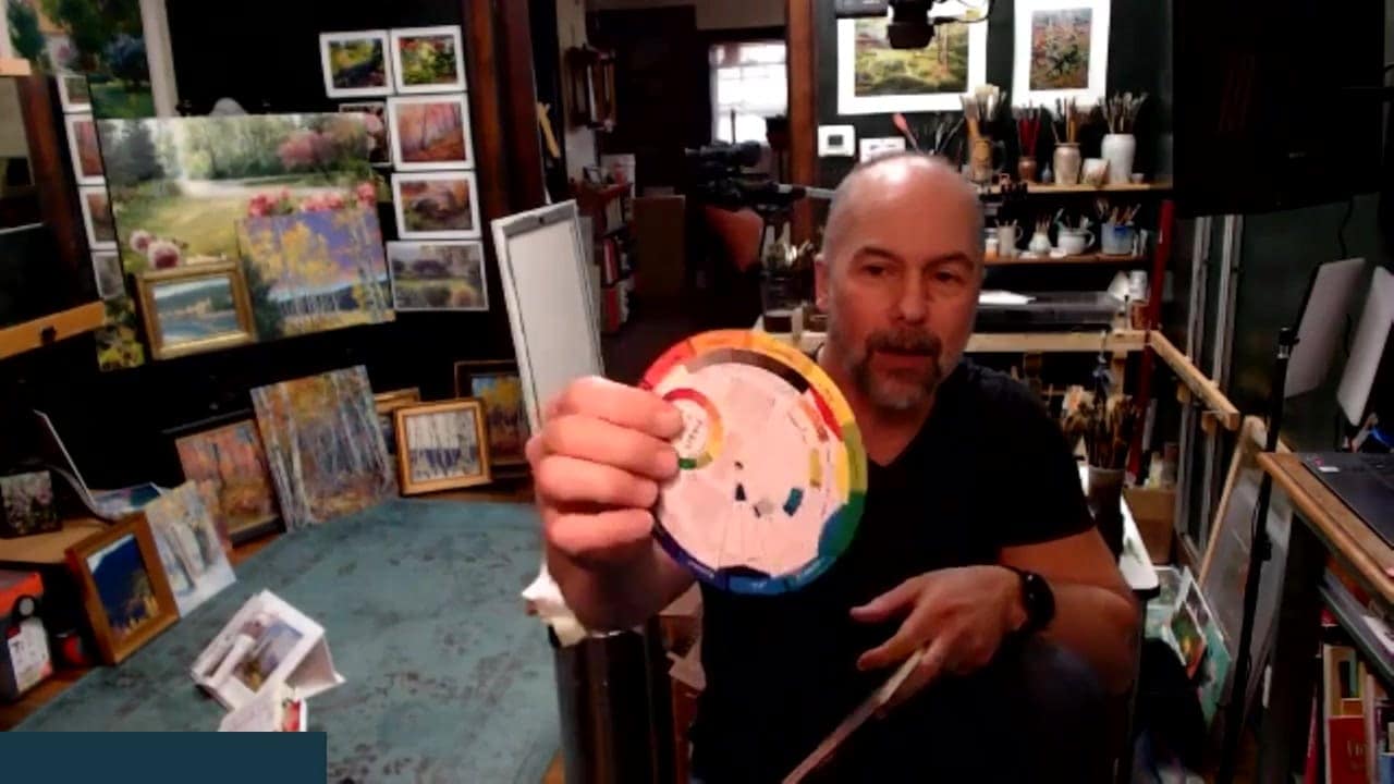 Members
Use a value scale and squint
Squint until the color and the value-scale chip blend, then use that comparison to judge whether the painted value is right.
Log in to watch →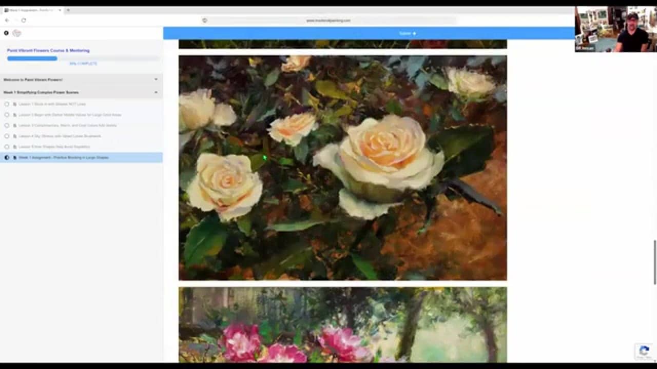 Members
Working value ranges for flowers and backgrounds
Explore practical value ranges and why flowers often appear brighter in color than they are in value.
Log in to watch →This page solves one painting problem. The library solves hundreds.
Full training library, critique replays, live-event replays, and a community of painters working through the same problems.