
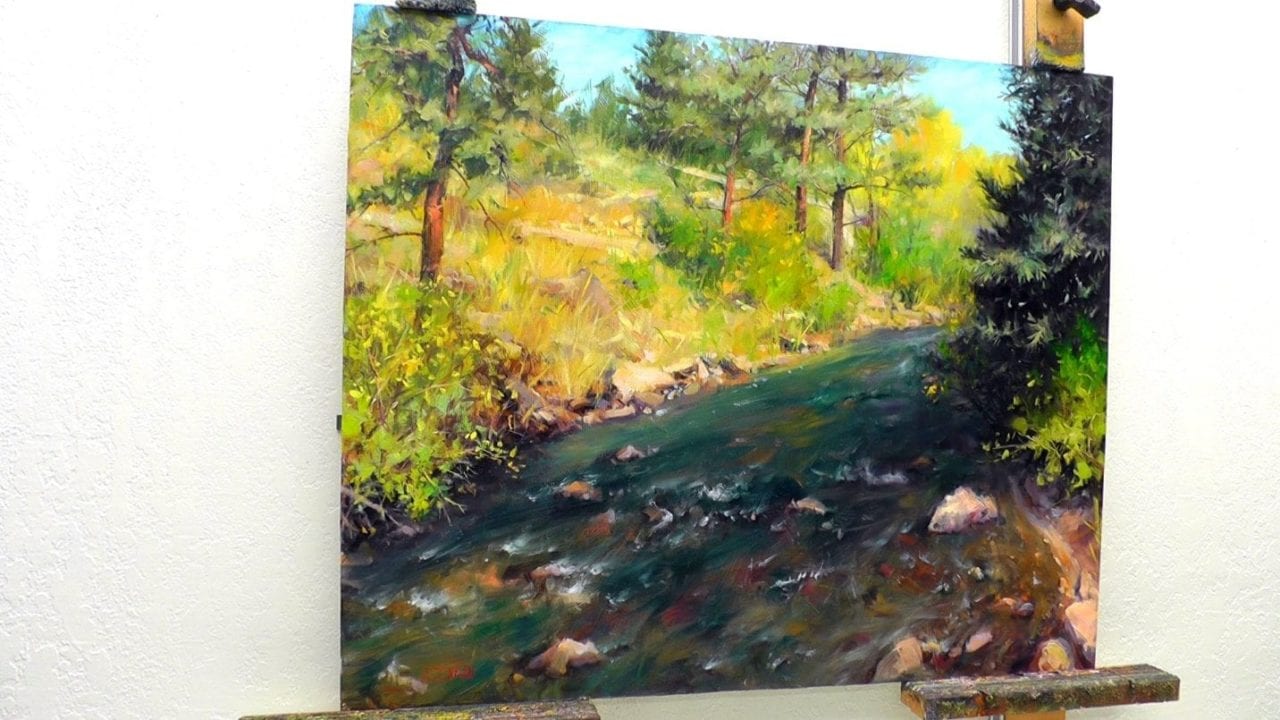
The painting Finding Gold in Estes Park was inspired by a day of hiking around with Kristie. We went early before the opening that night of an Oil Painters of America show I was in. There is so much to see in that beautiful Colorado town. We made sure we arrived with the early morning commuters.
We were exploring the outskirts of town when I saw this bend in the river. It had such a wonderful variety of trees and bushes, bright rocks with deep shadows, and a kaleidoscope of colors in the water.
The dry climate vegetation of Colorado creates some fantastic value and color shifts. Especially with the sparse yellow grasses and the deep dark greens of the fir trees.
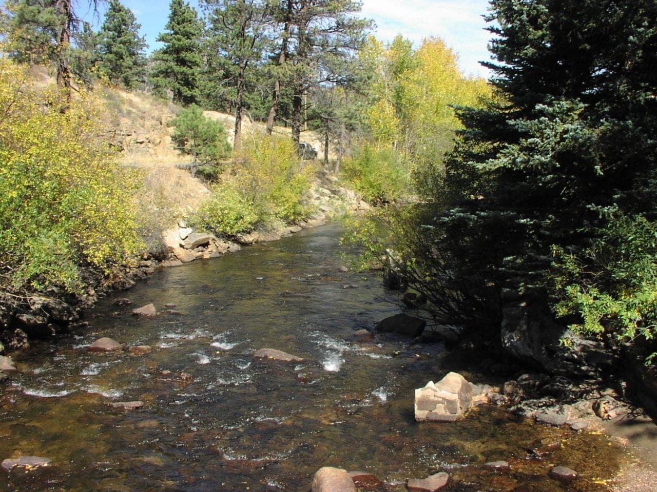
That dry climate and thin atmosphere also tend to desaturate and brighten all the colors.
This painting was an opportunity for me to increase the saturation of those colors. I moved those brighter earth tones from about a 2-3 brightness on the value scale to a 3-6. (1 being brightest and 9 or 10 being darkest).

Finding Gold in Estes Park by Bill Inman
After painting plein air or outdoors since the mid 80’s I have found that I often like to punch up the colors a bit. The most vibrant colors are in the middle values, especially in the 3-7 range.
You’ve noticed by now that I like to use the full range of the value scale.
The challenge is with the lightest lights. There is so much white involved that the colors are much cooler and desaturated. If we start with a bright value palette our painting lacks intensity – the colors get boring.
In the dark areas we can play a bit with warm and cool, but the distinct hue or color is more difficult to identify.
Keeping colors in the middle value range gives the painting vitality and richness. Then we can add bright highlights and dark accents to give the painting spark and shimmer.
Do you feel like one of your paintings is suffering from a dry and dusty look? Try sprucing up the middle value areas and adding some sparks of light and dark to give it gusto!
You can also use these 9 steps to learn how to paint vivid realistic trees and rivers.
And you can see every brushstroke of the journey in this nearly 6 hour training video along with over 20 other lessons as a Monthly Member.
![]()
Click to learn more about the Monthly Membership
How to Paint Estes Park River and Trees in 9 Steps
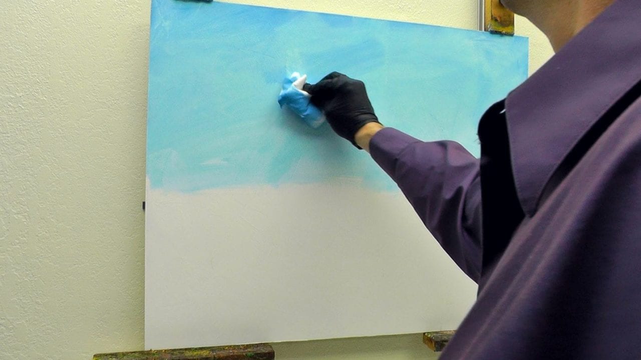
Step 1
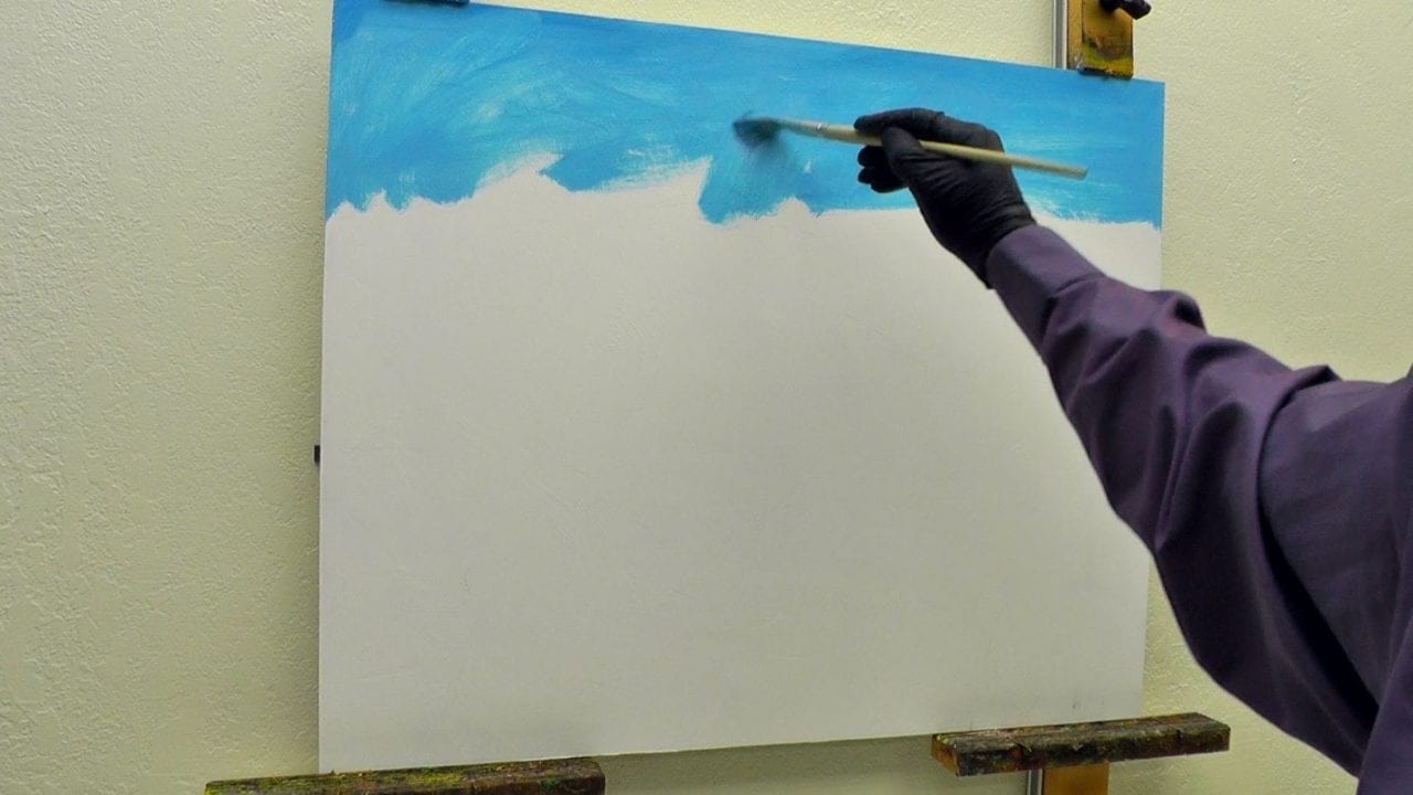
Brushing in a thin layer of Phthalo Blue mixed with white created the sky.
We need to be careful when we start off using white in our washes. It will deaden our rich dark shadows if the two mix.
I decided to use white anyway to get the correct value right off. Keeping the dark values isolated, I knew the white paint wouldn’t be a problem.
Using a paper towel, I wiped off most of the paint. The looser edges of the towel wiped in a haphazard fashion created the illusion of wispy clouds.
Step 2

Here is a suggestion – not a rule – for invigorating our paintings. Vary the shadow color with both warm and cool color temperatures. This will help simulate warmer indirect shadows and cooler direct cast shadows.
The direct cast shadows in this painting are cooler because of the warm sunny light source.
At this stage of the painting I am establishing the shadow patterns.
Getting the biggest shadow shapes in early is helpful. It’s easier to paint light over dark. Painting rich dark shadows over thick paint takes experience. Otherwise the white in the paint will dull the dark value.
Alla Prima is how I prefer to paint rather than letting each layer dry before going on to the next. Working while the paint is still wet gives me a lot more opportunities to play with edges. (like when I’m adding small branches through thick layers of paint).
Step 3
At this stage you can see the rich darker value hues I used for the under layers.
The dry sun-bleached colors in the reference photo seemed lackluster to me. Painting each color a few steps darker in value makes the painting more engaging. Then again, I like vibrant juicy color.
Notice the colors in the river. Pulling from all the landscape colors, I used them to make the water more colorful. I also thought about the rocks in the water and how I could exaggerate their effect on the colors in the river as well.
The river paint strokes I applied with a large size 10 or 12 hog bristle brush. With long sweeping strokes I alternated lighter and darker colors to simulate rushing water over a rocky bed.
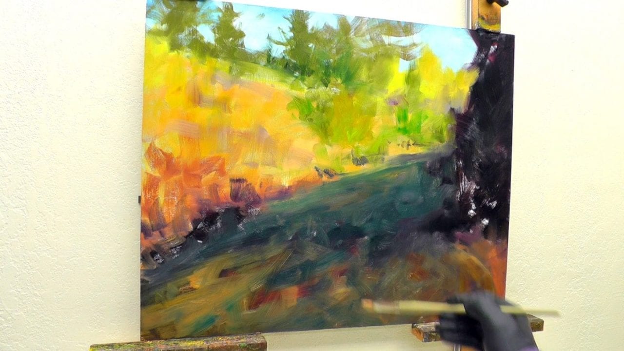
Step 4

Decades of direct observation of Ponderosa pines gave me more to work with than the lifeless trees in the photo. That is why I infused them with warm orange tones, instead of the photo’s colorless gray.
At this stage I also began adding details like rocks and rapids in the water. I then painted in shadows for the landscape’s trees, rocks and bushes.
Step 5

It was time to add 3-dimensional qualities to the large spruce tree on the right and the bush sitting beside it.
For highlights I used a combination of warmer and cooler greens. That gave the effect of more and less light hitting on the tree limbs.
I also tried to create an unpredictable mix of the sizes and shapes of the branches growing out of the shadows. The cookie cutter Christmas tree shape may be fun at Christmas time, but not in our paintings!
Notice all the different colors I’m using to form rocks, highlights and shadows. Lavender shadows below the right-side bush complement the orange in the sunlit shoreline.
Step 6
We’ve got to keep balance in our lives and paintings. That’s why I added the bush on the left. That way the bushes can share the goings on across the river with each other.
The lower left bush in the photo reference was way too dominant and took up a large area of the painting. I shrank the bush so the viewer would have more room to move around and explore.
I also played the bright leaves off of the shadow over the river. That creates a balance between the dark spruce tree on the right and the left bush. Otherwise the dark on the right would overpower the left.
Step 7

With the trees on the right side of the painting almost finished, it was time to work on the ponderosas.
With a size 6 Isabey 6158 Flat mongoose brush I created thin branches. Since the Isabey’s are tough to find, I recommend Rosemary’s Masters Choice Flats Series 274.
The branches are a warm dark mixture of ultramarine blue, alizarin permanent, transparent oxide red and sap green.
The colors and values of the spruce trees at the top of the hill were too like the ponderosa trees in front of them. Overlapping those trees with the dark ponderosa branches helped separate the two groups. The branches also gave a wonderful 3-dimensional quality to the trees.
I used the canopies of needles to cast shadows on the tress for light and shadow variety.
When I brushed in the early tree shapes I made sure that my brush strokes were interesting and loose. You can see how some of those distant tree shapes remained untouched to the end of the painting.
We never know what part of our paintings will endure the test of time. We want to create engaging shapes and patterns all the way through from start to finish.
Now of course not all those shapes were fun to look at – like the green swish in the sky that I removed in the next stage.
Step 8

Some exciting stuff now comes on the scene. I love the tall sparse grasses and touches of oranges and yellows in the bushes. These are the final 10 percenters that add vitality to the painting.
We don’t want to add lots of bright value yellow grasses everywhere. I was very strategic in placing clumps and strands of grass as transitional elements. They help tie all the rocks, bushes and dirt together, soften edges and add variety to the contrasts. The grass colors varied between yellows, oranges and greens.
This was a good time to clean up any brushstrokes or spots that stood out too much or felt out of harmony. We want every part of the painting to feel like it belongs and is intentional.
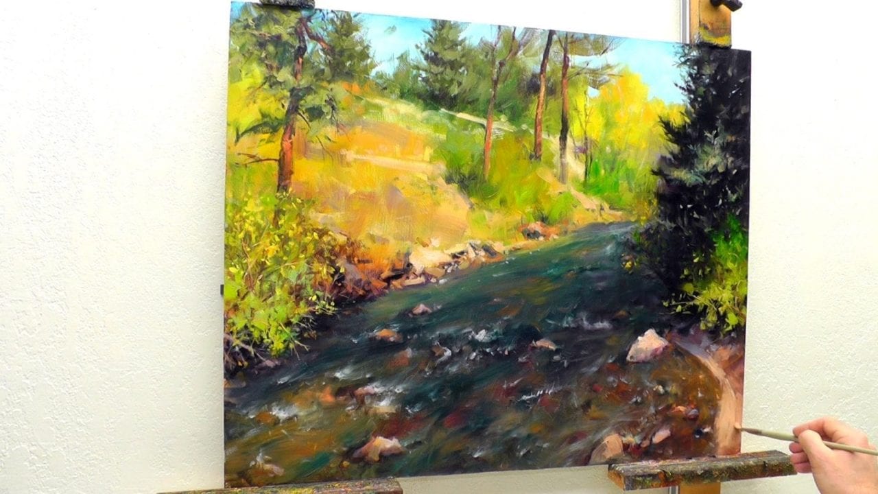
Step 9
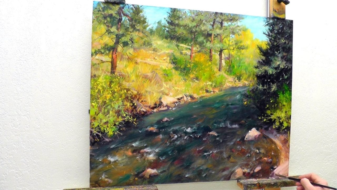
I liked the colors and finish of the lower right hand shoreline. Then I added all the finishing touches to the rest of the painting. That made the shoreline need some sprucing up as well.
So, I began by adding a long rock to the bottom. There weren’t any rocks in the photo so I had to make them up. Plenty of experience comes in handy for creating believable rocks from imagination.
I realized that one long rock became a wall or barrier to the viewer. So, I broke it up into two rocks.
I kept one larger than the other. The shadow side of the larger rock helps lead the viewer right up the shoreline and into the painting.
Those rocks added energy and interest to the bottom right corner. I had a lot of fun playing with the colors and values of the highlights and shadows. I especially love the complementary yellows and oranges next to the lavenders.

Finding Gold in Estes Park by Bill Inman
If you haven’t visited Estes Park yet – go. It is one of the fantastically beautiful places we find on this earth.
Once you visit there you will not be able to restrain yourself. You’ll be grabbing your paints and capturing that beauty on canvas!
Are you dying to see the entire process and learn how I painted this from start to finish? You can find this entire video as one of over 20 full length painting videos in the Monthly Membership. Here’s a preview of Estes Park:


Thank you for breaking down the complexity of your beautiful painting. It helps instill the confidence, that with lots of practice, I may be able to paint quality paintings myself…in time
Thank you Cheryl – I’m a firm believer that anyone who puts in the time and constantly observes what they paint can master their craft. I hope you continue to grow in confidence and have fun learning and painting all along the way.
I am a monthly member but I forgot how to access the monthly lessons. Will you tell me again?
Hey Betty! Could you shoot me an email so that I can help you get access?
From majestic old cream and tan sycamores…to conifers bent under the snow, trees are an inspiration. Maybe it is because, even though they are anchored to the earth, they spend their life reaching for the heavens and doing good where they are planted. I enjoyed walking through the light and shadows of Bill Inman’s forest.